
I recently found these two spectacular images of the Earth, and after marvelling at the beauty portrayed, and the science that made the capture/creation of these images possible, I also started thinking of how these photos embodied the attitudes of their representative countries.
Please click the pictures for full screen versions, it may take a while to load but it is well worth it.
 |
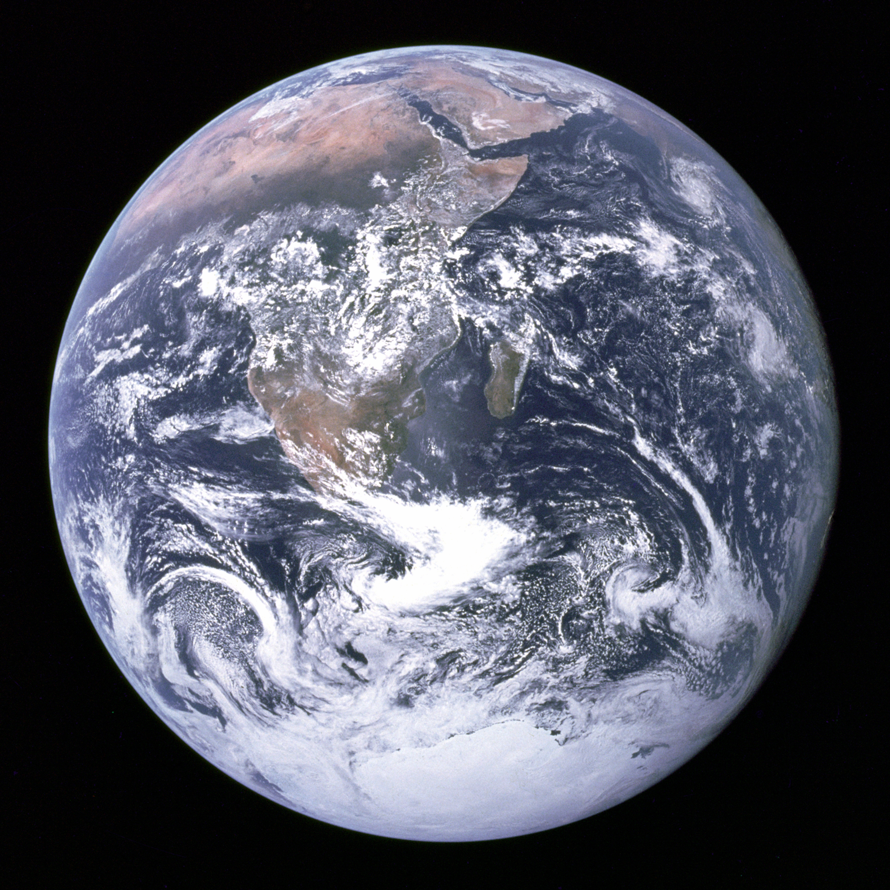
| Earth - The American Way |
So, this is Earth as seen by Americans from fourty five thousand kilometres away. This is actually a composite image, stitched together from thousands of other images, the most famous of which is known as Blue Marble (thanks Wikipedia!). That link points you to a picture of the Earth, as photographed from NASA satellite Apollo 17, way back when on December 7th, 1972 at precisely 5:39 am UTC. This is quite releveant, because at this time, over this point on the Earth, Africa and India are fully lit up whilst the East is experiencing sun down. The photo was taken with the sun behind the astronauts, and shows Earth fully illuminated.
Along with several other images, it was stitched together to give a 'true color' image of the world. The original has a 1pixel/kilometre ratio. A true colour image means that even though it might not be a photo as we know it, it has been corrected to give an approximation of the colours as we see them. In this case, a lot of the image comes from infra-red sources, amongst other things.
With it's rich blue oceans and verdant green land, it's a breathtaking image. It is typically American, with it's overly saturated and unnaturally rich colours lending the image an optimistic feeling. It has a slightly artificial, unnatural look to it. This is Earth as imagined in a Pixar movie.
 |
| Some Images are more equal than others |
And here we have the earth, photographed by Russian weather satellite Elektro-L, from thirty six thousand kilometres away. This is the first major spacecraft developed and launched by post-Soviet Russia, With it's darker seas and browner terrain, it seems a far more austere representation of the Earth as we know it, bringing to mind war torn pictures. Somehow, it seems like a far more realistic capture of the Earth than we would imagine NASA's effort to be.
The Russian images are created from a mixture of near-infra-red and visible wavelengths. Any details out of our visible wavelength are given an unnatural colour. All plant life appears red, for instance (representing the infra-red they reflect). This means that they show the Earth in a way that humans wouldn't see, using the naked eye.
Which means that, surprisingly, NASA's gorgeous green and blue representation of the Earth is actually closer to what we would see if we took a ride up to space (with Richard Branson as our tour guide, maybe).
It's interesting to note that despite the enormous effect that humans think they've had on the Earth, it's still impossible to directly see much evidence of it from fourty thousand kilometres away. No settlements jump out, no enormous ocean liners make themselves obvious, and no planes or other aerial craft interrupt this view. Maybe it would be a different story if this was taken over Europe or North America, but from this view of the Pacific Ocean, Earth looks like a place where calm and tranquility reign supreme.
Credit to Russian Space Web and Visible Earth for these images.
No comments:
Post a Comment